


Futuristic Global Decrease Chart on Animated World Map
By rodionova- Length
- 0:20
- Resolution
- 3840 x 2160
- File Size
- 2.53 GB
- Frame Rate
- 30 fps
- Alpha Channel
- No
- Looped
- No
- Video Encoding
- Photo JPEG
- Orientation
- Horizontal
- Commercial License
- Further Information
Description
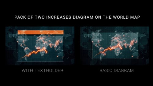
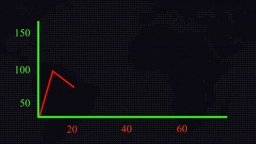
This dynamic motion graphic presents an animated world map overlaid with a precise grid and an array of glowing blue data points, signifying global activity. A prominent line graph visually tracks a decreasing trend, originating from the top left and descending across various continental regions. As the line fluctuates, key percentage decrease values emerge, highlighting specific points of data reduction. The overall aesthetic is sleek and technological, utilizing a dark background with vibrant blue illuminations that convey a sense of modern data analysis. This animated clip is an excellent asset for projects requiring a sophisticated visualization of global trends, financial reports, statistical declines, or impactful informational presentations.
.jpg?w=500&cf_fit=cover&q=85&format=auto&s=11c67854324a3eed2b1e3706cf41f9e673dfb9549b94b3e136ea4be7a5c99da2)
.jpg?w=500&cf_fit=cover&q=85&format=auto&s=a95280fadc449abf9acc7d72319d0bd69604f8ee9bc0f1af4672c766f588c184)


Futuristic Global Decrease Chart on Animated World Map by rodionova